Case study SaaS B2B UX/UI Design
Less bureaucracy, more support
Role
UX/UI & Product Design
Industry
Business to Business(B2B)
Duration
14 Days


Introduction to the project
This project documents the strategic and design process of the Nexo case. The goal is to present, step by step, the evolution of a financial SaaS that uses artificial intelligence to eliminate operational complexity and humanize data management.
Current scenario
After analyzing the platform's metrics, I realized that it was necessary to investigate the platform a little further.
Problems
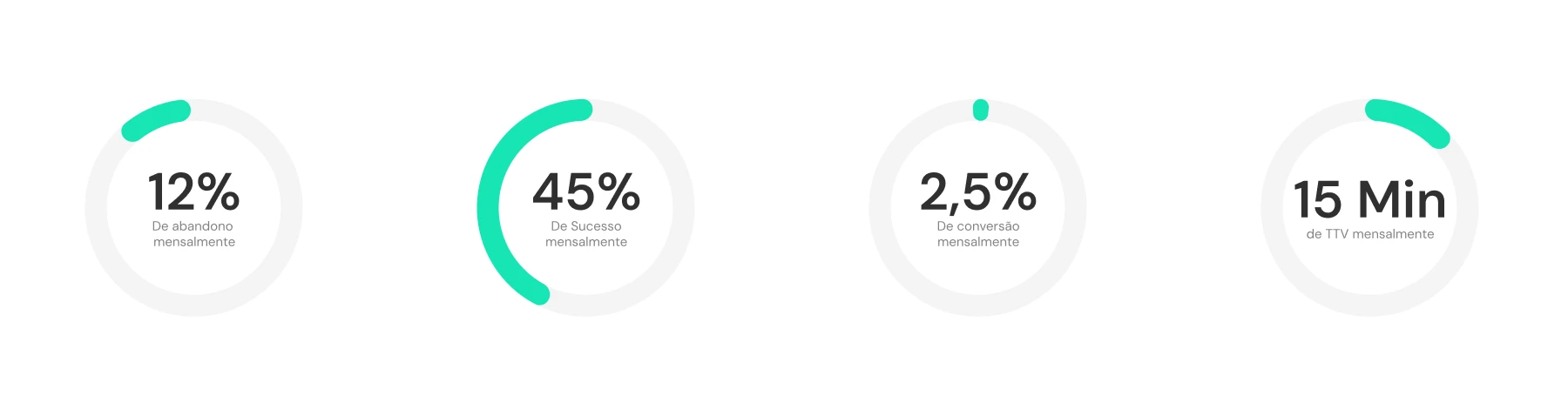
High monthly churn rate (12%), indicating friction in the user journey, especially in the first contacts with the product;
Low conversion rate (2.5%), highlighting difficulties in the transition from engagement to action;
Long time to value perception (average TTV of 15 minutes), impacting user retention and satisfaction;
Misalignment between users who start the journey and those who successfully complete tasks, despite a 45% success rate.
Challenge
Make design decisions with measurable impact on strategic metrics, even in the face of multiple hypotheses and limited data.
Objective
Reduce the abandonment rate and accelerate the perception of product value, increasing conversion and user engagement throughout the initial journey.
Results Achieved
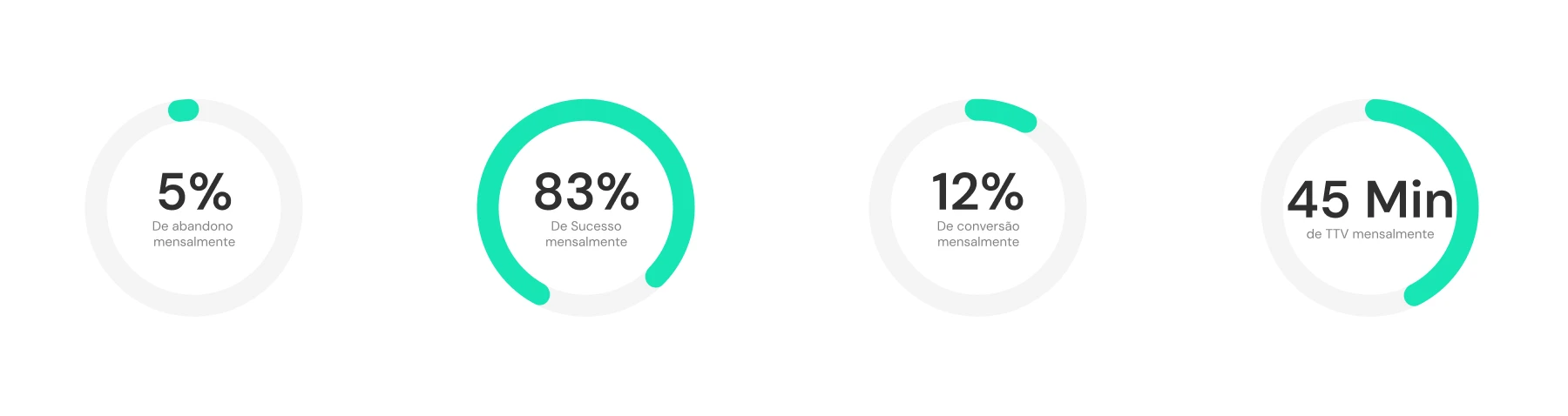
Reduction in abandonment rate to 5%;
Increase in success rate to 83%;
Growth in conversion rate to 12%;
Increase in Time to Value to 45 minutes.


Desk Research
I decided to conduct in-depth research to look for support complaints from other people who had already used competitors' products.

Avaliable links: Reclame Aqui - Nibo Reclame Aqui - Granatum Reclame Aqui - Hábil Reclame Aqui - Granatum
Benchmarking
I performed functional benchmarking comparing the main players in the market with the aim of identifying gaps in experience and opportunities for innovation.


Arquitetura da informação
I decided to create the information architecture to gain clarity on what really needed to be designed within the platform. This process helped me avoid excess pages and features, reducing the amount of information presented to the user and keeping the focus on the main objective of the product: allowing the user to create a project with as little effort as possible.

User Flow
I chose to map the user flow for the same reason as the information architecture: to have clarity in design decisions. The focus was to ensure that, when accessing the overview screen, the user already had clear and immediate actions to create a new project or request help via AI without having to explore other screens or deal with unnecessary paths.

Wireframe
I created wireframes to quickly validate layout and hierarchy decisions before moving on to the final look. I used Figma's AI to speed up the creation of the initial structures, which allowed me to iterate faster and focus on the clarity of the product's main actions.

Design
The visual design was developed to direct the user's attention to the most important actions, reducing noise and facilitating decision-making. The speed of the process allowed more time for refinement and validation of the proposed solutions.

Design System
I created the design system to ensure consistency and scalability for the product. To speed up the process, I used Figma libraries as a basis, adapting components and patterns to the product context, which reduced rework and facilitated future iterations.

Heuristic analysis
I decided to perform a heuristic analysis to quickly identify potential usability issues and save time in the validation process. Considering that the main functionality evaluated was the action of asking an AI agent for help, it was not necessary to conduct usability tests with users, as the flow was simple, straightforward, and with a low level of complexity.

Results obtained
Reduction of the abandonment rate to 5%;
Success rate increased to 83%;
Conversion rate grew to 12%;
Time to Value increased to 45 minutes.

Other projects

Áurea Case Study
Case study of Áurea, an application for routine management

Tripideias(case)
Tripideias case studies, an application that offers personalized packages

DenandKen - Institutional Website Organic Children's Brand
The taste of childhood in a juice

Shopwave app(Mobile)
Shopwave is an e-commerce application that offers a wide variety of products

Notch Saas Website
Revolutionize your creativity with visual intelligence where AI transforms ideas into images with futuristic precision.